I continued to play with my final three refinements. I decided to push a few of them further and make the letters more legible. I also wanted the order of the letters BOS to be more legible. In a few of my final refinements they read more like BSO. Below are my final three refinements followed by the various different options I created that stemmed from those three refinements.
Showing posts with label Type1. Show all posts
Monday, November 23, 2015
Sunday, November 22, 2015
[P4]:3
I took my original font manipulation sketches and then took them into illustrator and began manipulating the actual fonts in the computer. I experimented a lot with layering the text to make a more impactful mark.
Wednesday, November 18, 2015
[P4]:2
The second step in this project consisted of me sketching over 30 different marks. I focused on the manipulation of the letters and how they can be grouped together. Because my airport is the Boston airport, it's letters are BOS.
Sunday, November 15, 2015
Monday, October 26, 2015
[P3]:2
-- What are small capitals? How are they different than something set in ALL CAPS?
Small Capitals are capital letters that are the size of the lowercase "x" height. They transition more naturally between lowercase and uppercase.
-- Does your font have small caps? If not name a font that does.
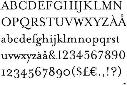
My font, Mrs Eaves does have small caps, along with a wide variety of weights.
-- Ligatures? why are they used? when are they not used? what are common ligatures?
Ligatures are two letters that are connected because they would overlap or throw off the the kerning between the other letters. "The Chicago Manual of Style, for example, advises against using them in Latin or Greek transliterated words or in foreign words that have been adopted into English and are thus in an English dictionary. They do, however, recommend using ligatures to maintain Old English spelling in an Old English context or in foreign languages where they are commonly used characters." Common ligatures include the lowercase "f" attached to a letter like "l" or "i".
-- Does your font have ligatures? If not name a font that does.
My font does have ligatures
-- Difference between a foot mark and an apostrophe?
A foot mark does not have the rounded part at the top. It looks more like a vertical dash whereas the apostrophe has a rounded appearance with a circular part at the top.
-- Difference between an inch mark and a quote mark (smart quote)?
This is similar to the difference between a foot mark and an apostrophe. The inch mark is a double prime or vertical dashes whereas the quote mark is two curved lines with circular attachments at the top.
Small Capitals are capital letters that are the size of the lowercase "x" height. They transition more naturally between lowercase and uppercase.
-- Does your font have small caps? If not name a font that does.
My font, Mrs Eaves does have small caps, along with a wide variety of weights.
-- Ligatures? why are they used? when are they not used? what are common ligatures?
Ligatures are two letters that are connected because they would overlap or throw off the the kerning between the other letters. "The Chicago Manual of Style, for example, advises against using them in Latin or Greek transliterated words or in foreign words that have been adopted into English and are thus in an English dictionary. They do, however, recommend using ligatures to maintain Old English spelling in an Old English context or in foreign languages where they are commonly used characters." Common ligatures include the lowercase "f" attached to a letter like "l" or "i".
-- Does your font have ligatures? If not name a font that does.
My font does have ligatures
-- Difference between a foot mark and an apostrophe?
A foot mark does not have the rounded part at the top. It looks more like a vertical dash whereas the apostrophe has a rounded appearance with a circular part at the top.
-- Difference between an inch mark and a quote mark (smart quote)?
This is similar to the difference between a foot mark and an apostrophe. The inch mark is a double prime or vertical dashes whereas the quote mark is two curved lines with circular attachments at the top.
-- Hyphen, en dash and em dashes, what are the differences and when are they used.
An em-dash is typically used to act as a comma or parenthesis to separate out phrases—or even just a word—in a sentence for various reasons. A dash is a longer line—double the length of a hyphen—which indicates a break or an interruption in the thought. Dashes are used to set off part of a sentence.The en dash connects things that are related to each other by distance, as in the May–September issue of a magazine.
Thursday, October 15, 2015
[P3]:1
Information about Mrs Eaves Font
It is a SerifDesigned by Zuzana Licko
Zuzana also designed the fonts: Base 9 and 12, Base 900, Base Monospace, Citizen, Dogma, Elektrix, Filosofia, Hypnopaedia, Journal, Lo-Res, Lunatix, Matrix II, MatrixII Display, Modula, Mr Eaves Sans, Mr Eaves XL Sans, Mrs Eaves XL, Narly, Oblong, Program, Puzzler, Senator, Soda Script, Solex, Tall Pack, Tarzana, Totally Gothic, Triplex, Variex and Whirligig
Mrs Eaves was designed in 1996
It is a Transitional Serif
Its family members consist of: Roman, Italic, Bold, Bold Italic, Small Caps and Petite Caps
General Font Information
Old Style: (ex. Bembo, Sabon and Monotype Garamond) curved strokes whose axis inclines to the left, and little contrast between thick and thins.Transitional: (ex. Baskerville, Mrs Eaves and Georgia) they mark a transition from the former Old Style types and Modern types
Modern: (ex. Bodoni, Bedini and Dubiel) It has high and abrupt contrast between thick and thin strokes and abrupt (unbracketed) hairline (thin) serifs
Slab-Serif: (ex. Archer, ITC American Typewriter and Officina Sans) This font was born In Britain as an advertising scheme. They wanted a font that would stand out against the page.
Sans-Serif: (ex. Helvetica, Avant Garde and Arial) A Sans-Serif font is one that does not have Serifs at the tops or bottoms of each letter.
Stroke Weight: The general thickness of the lines that a letter is comprised of, in other words, how bold the font is
Axis or Stress: In typography, the axis of a letter generally means the axis of the stroke, which in turn reveals the axis of the pen or other tool used to make the letter. If a letter has thick strokes and thin ones, find the thick strokes and extend them into lines. These lines are the axis (or axes; there may be several) of the letter. Not to be confused with slope.
Small Caps: Create a clean line with no ascending elements, and mix well with lowercase letters
Lining Figures: Uniform in height and align with the baseline and x-height
Non-Aligning Figures: When the figures, typically the numbers dip below the baseline and above the x-height
Ligatures: Letters that come together to avoid a clash of characters. The f joins with the lowercase letter I to create ligature
Type Measurement: The point system used to measure type refers to the way type was laid out on the press. Referring to the metal body the type face was mounted to.
Below is an image that shows the anatomy of a typeface:
Wednesday, October 14, 2015
[P2]:Final
This project was a two step process defined as:
1—use fontstruct® to create a typeface then, 2—develop a content-rich, analogue/print specimen to persuade the recipient to ultimately use your typeface. consideration should be given to the audience—students, designers, art directors or other design-related, typeface-loving professionals conversant in basic typography and design.
I began the project with the notion that I would not like designing a typeface, however, this was proven untrue by the end of the project. I really enjoyed the final work I created and I am proud of my typeface. The most important thing I learned from this project is that the way we present our work as designers is just as important as the work itself. The keywords for my font are: sharp - the font consists of many right angles and the decorative aspect that cuts through the letters resembles a cutting motion; linear - There are very little curves in my font. I tried to reduce the amount of distractions by making everything very clean lined; contemporary - The font could be used in a modern apartment complex, or used to describe something futuristic.
Below are some images of my final deliverable mailer and poster.
1—use fontstruct® to create a typeface then, 2—develop a content-rich, analogue/print specimen to persuade the recipient to ultimately use your typeface. consideration should be given to the audience—students, designers, art directors or other design-related, typeface-loving professionals conversant in basic typography and design.
I began the project with the notion that I would not like designing a typeface, however, this was proven untrue by the end of the project. I really enjoyed the final work I created and I am proud of my typeface. The most important thing I learned from this project is that the way we present our work as designers is just as important as the work itself. The keywords for my font are: sharp - the font consists of many right angles and the decorative aspect that cuts through the letters resembles a cutting motion; linear - There are very little curves in my font. I tried to reduce the amount of distractions by making everything very clean lined; contemporary - The font could be used in a modern apartment complex, or used to describe something futuristic.
Below are some images of my final deliverable mailer and poster.
Wednesday, October 7, 2015
[P2]:6
I made revisions to my poster based on what other people said about my work. Here is the poster printed off tiled.
Monday, October 5, 2015
[P2]:5
These are the first iterations of my final deliverable poster. I hope that the graphics represent the sharp and dramatic nature of the font.
Sunday, September 27, 2015
[P2]:4
GOTHAM
I chose to report on the font Gotham because I was initially attracted to how intense it is. The font is extremely impactful because of it’s bold, thick lines. Gotham would be classified as a geometric sans-serif. The font is commonly found on signs in cities because of it’s contemporary, modern aesthetic. Gotham is very legible, therefore it is the perfect candidate for quick headline reading or perfect for signage. The font is “somehow familiar”. It’s look is modern and classical at the same time. It’s design seems to transcend time and place, making it universally legible and understood.
information from: http://www.typography.com/fonts/gotham/overview/
Thursday, September 24, 2015
[P2]:3
The following is my revised font complete with uppercase letters and numerals.
A few keywords I would use to describe this font would be Sharp - The font seems like it would poke you if you touched it, Contemporary - The font is extremely modern, Linear - the font only uses straight lines. Below is an image of my font along with images of the font with visual definitions of my keywords. I added text on top of images to reflect my keywords and allow for the viewer to understand the font in context.
Tuesday, September 22, 2015
[P2]: 3
The following two fonts are two fonts that I came up with and assigned keywords to.


Keywords: Layered - Relates to the way you could take away different layers of the letters and it would still be legible, Mysterious - The font seems to hold hidden meaning with it's different lines, Elastic - The letters in the font look like they would bounce if you dropped them on the ground.
The following font is the uppercase letters and the numerals for my final font. 

Keywords: Sharp - The font seems like it would poke you if you touched it, Contemporary - The font is extremely modern, Linear - the font only uses straight lines.
Tuesday, September 8, 2015
[P1]: 4
Phase 3
Phase three of project one allowed us to use both color, the computer and various different sizes in our font. Also, we were permitted to utilize typographic rules. For this phase it was difficult not to become overwhelmed with the amount of options we were permitted. Rather, I had to focus my eyes on what I was creating and think outside of the box. Most of my designs from this phase seem much more creative and expressive than my previous two iterations. I utilized various text sizes as well as the overlapping of text to get the look I desired.
Paul Rand was born in Brooklyn, New York in 1914. Although Paul Rand the person might not be easily identifiable to the general public, the work he created is. He did amazing logo designs for large companies like UPS, IBM and ABC. Rand also worked as the art director for Esquire's fashion pages.
Information from: http://thinkingform.com/2014/09/24/thinking-mimmo-castellano-09-24-1932/#/2013/08/15/thinking-paul-rand-08-15-1914/
Information from: http://www.designersandbooks.com/designer/bio/paula-scher
Information from: http://thinkingform.com/2014/09/24/thinking-mimmo-castellano-09-24-1932/#/2013/08/15/thinking-paul-rand-08-15-1914/
Max Huber
Max Huber was born in Switzerland in 1919 and studied at the Zurich school of Arts and Crafts. He worked for many different people across Europe and his portfolio ended up being very diverse. His work infused text and images in a way that made the piece very visually intriguing.
Information from:
http://thinkingform.com/2014/09/24/thinking-mimmo-castellano-09-24-1932/#/2011/06/05/thinking-max-huber-06-05-1919/
Robert Massin
Robert Massin began designing books at the age of seven. Massin was another designer who worked a lot with pictures and text. He was amazing at merging the two together. Some of his most famous work came from the silhouette images he made for “The Bald Soprano”.
Information from:
http://creativepro.com/dot-font-massin-the-unclassifiable-free-thinker/
Erik Spiekerman
Erik Spiekerman is from Germany, he was born in 1947. He began working freelance in 1972 and after 7 years he started MetaDesign with two other people. He has since left MetaDesign and no works at his own company called Edenspiekermann. He works primarily in the fields of type and logo design.
Information from:
http://thinkingform.com/2014/09/24/thinking-mimmo-castellano-09-24-1932/#/2011/05/30/thinking-erik-spiekermann-05-30-1947/
Armin Hoffmann
Armin Hoffmann was born in 1920. The designer created great posters that utilized black and white designs. The lack of color pushed the designer to express a meaning without spelling it out for the onlooker. The majority of his career was spent in the classroom. He taught an advanced graphic design course at Allgemeine Gewerbeschule (AGS) in Basel.
Information from:
http://thinkingform.com/2014/09/24/thinking-mimmo-castellano-09-24-1932/#/2011/06/29/thinking-armin-hofmann-06-29-2011/
Paula Scher
Paula Scher began her career as an record cover art director at Atlantic and CBS Records in the 1970s. She has since branched out to brand identity where she has done work with many large companies from Coca-Cola to The Daily Show with Jon Stewart. Scher's use of type as the physical image is unmatched by any other designer. She integrates type so that it becomes the image she is trying to convey.Information from: http://www.designersandbooks.com/designer/bio/paula-scher
Subscribe to:
Posts (Atom)