Wednesday, November 9, 2016

Project progress

I am feeling a little bit lost as this project is approaching the halfway mark. I honestly feel confused when I open Sketch and I am discouraged by my lack of motivation with this project. I do not know what to do to light the fire under my feet and work passionately about this app. I am optimistic that the end product will be great and hopefully a portfolio piece. However, if I put live action into my video I am worried it will scream mediocre. 

I still need to make my storyboard, but, again I am at a loss with what to do for my video especially considering I do not have a solid grasp on what my app is going to look like. Progress-wise I feel I am moving far too slow. I need to begin designing the app but need to solidify my wireframes first. I still need to track down if this app is even completing the project requirements. I want this app and  project to be a great portfolio piece for me but I am at a loss for where to turn or what to do next and my lack of motivation isn't helping any either. 

I do, however, have a wireframe with seven solid screens that all seem to be effective and understandable. I attached an image below.

Thursday, October 27, 2016

Habits Research


The definition of a habit:

a settled or regular tendency or practice, especially one that is hard to give up.
"this can develop into a bad habit"

Habits affect most everyone. It is difficult to know why/how they begin but they are very difficult to break. Personally I have a bad habit of not texting people back or forgetting to respond. I also tend to pop my knuckles.


I found an article online about habits, in the article it talks about how you know your habit is more that just a habit:

A condition called Tourette syndrome (also called Tourette disorder) causes a person to have repeated involuntary jerky movements (motor tics), make facial grimaces, and repeat certain sounds or words out loud (vocal tics). These tics can seem surprising and odd to others, who do not understand what is causing them. 


Read more: http://www.humanillnesses.com/Behavioral-Health-Fe-Mu/Habits-and-Habit-Disorders.html#ixzz4OJR1f3ax


http://www.humanillnesses.com/Behavioral-Health-Fe-Mu/Habits-and-Habit-Disorders.html

Interestingly, this article is about how and why the habits you are trying to start aren't sticking:

http://jamesclear.com/habits-fail

The article talks about different problems that could be the reason why your habits aren't sticking and they all make logical sense. It has problems like trying to do too much at once, not changing your environment and working towards the goal instead of the process.


Wednesday, October 12, 2016

Process Blog Post

Our team is working better together than we were in the beginning. We have great communication and are able to divide the workload. I was in charge of making the game flow and then I was also in charge of making the card template and making half of the cards. Lizzy was in charge of the icons and then making the other half of the cards. Tessa and Paige were in charge of the instruction pages and then the "pull sheets" the players fill out per game. Also, Tessa was in charge of printing all the material. Below is a few screenshots of documents we worked on as a team as well as the game flow I created and the cards.

Tuesday, September 27, 2016

Blog post / Facilitate play / 9_28

Who's infographic resonated with you? Share your thoughts and insights on their topic. 

The infographic that resonated with me the most was Jenny's wage gap infographic. I know how hard she worked on it and it is interesting to see all of the data she collected come together into one graphic. I also really liked her topic, I thought that her information was very shocking and I was saddened by the fact that the women on the US national team make so little compared to the men. I also really liked Jenny's color palette and her typeface choice. I thought that the way she organized her information made logical sense and it flowed nicely from statistic to statistic.


Sunday, September 11, 2016

INITIAL DESIGN:

Sexual assault and rape on college campuses (demographic of college men)

THESIS: Sexual assault and rape is more prevalent on college campuses than one may assume. By better educating yourself on the complexity and commonality of the issue you can become more sensitive to the struggles women go through after being sexually assaulted. Also, you can help those who may be incapacitated or steer clear of sexual assault yourself. 

RESOURCES:

 The Campus Sexual Assault (CSA) 


Wednesday, April 13, 2016

Their Finest Hour - Winston Churchill

_ Who is speaking? 

Winston Churchill

_ Why was/is the speech important to society? 

The speech was  given just over a month after Churchill took over as Prime Minister of the United Kingdom at the head of an all-party coalition government. It was the third of three speeches he gave during the period of The Battle of France.

_ Why do you feel it is important or interesting?


The speech is equally interesting and important. The speech was meant to empower the troops and to express the gravity of the situation. 

_ What is the emotion, mood, tone, personality, feeling of the speech?


The emotion is intense. Powerful. The mood is almost solemn. Churchill understands the gravity of the situation. The tone is impactful and even. The personality is almost quiet. he emphasizes interesting words. 

_ What is intonation, emphasis, what is loud, stressed, or soft. Where are there pauses... 


When Churchill speaks he pauses between every three or four words. He gets louder as he speaks emphasizing the last of three or four words. Other than that he speaks relatively softly. 

_ What do you FEEL should be loud or soft, long pause or rushed?


Sometimes in the speech I feel as though Churchill emphasizes the wrong words. For instance, at the end of the speech I feel like the word that should be emphasized is the FINEST hour but instead he emphasized the word this before "their finest hour". 

_ Is there a call to action? When listening to it what are key/emphasized words? 


The call to action is essentially don't give up. "Brace ourselves to our duty". Don't stop fighting. 

_ How does it make you feel? 


It kind of gives me a mixed feeling of sadness, solemn but also firmness and an unwillingness to give up. 

_ How do imagine that the audience felt? 


I imagine that the audience felt empowered. Churchill had to have a tone of solemness because of the bleak feeling of the war. However, if I was in the audience I feel like I would feel the gravity of the situation and feel almost like sadly empowered by what Churchill was saying. This is a moment that The war could go either way and he is inspiring the troops. 

_ Could there be another interpretation of the speech?


I don't think there is another interpretation of the speech. It could be representative of Churchill as a leader and he is almost inspiring himself to lead his country through the tough time. 

_ Write/find a short bio, of the person giving the speech. 


was a British statesman who was the Prime Minister of the United Kingdom from 1940 to 1945 and again from 1951 to 1955. Churchill was also an officer in the British Army, a historian, a writer (as Winston S. Churchill), and an artist. He won the Nobel Prize in Literature, and was the first person to be made an honorary citizen of the United States.

Saturday, February 27, 2016

Famous Poster Designers

Armin Hofmann

The posters he created in the late 1950s and 1960s for cultural clients such as the Kunsthalle Basel and the Stadttheater Basel possess great typographic and photographic purity of form. His designs represent an idea in it’s most pure form as possible for example, he uses an altered photo of an ear to represent sound.


Studio Dumbar

Studio Dumbar’s work is colorful and a perfect example of typography being integrated into a design. The studio uses stretching and pulling to push type to the point of near illegibility.


Paula Scher

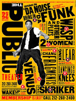
Scher is included in this list because of the way she turns and organizes type to create modules and interesting pattern in her posters for the NY Public Theater. Scher also uses vibrant color and lines to organize and call attention to different aspects of her designs.


Joesf Muller-Brockmann

Josef’s work can be categorized as Swiss International Style. Brockmann utilizes this rigid structural system while at the same time integrating his type into his designs and images in an interesting manner.  


Herbert Matter

Matter’s work is included on this list because of his unique type treatment in titles. Particularly in the magazine Art and Architecture.

Thursday, February 18, 2016

Summary of Abbott Miller's Branding has become oppressive.

Here is a link to the article I am summarizing: http://www.fastcodesign.com/3035300/pentagrams-abbott-miller-branding-has-become-oppressive/7

This article is short and sweet. Abbott Miller is frustrated with the world of branding. When Miller first started out he had to sell his designs to companies and persuade them that branding was essential to a great company. Nowadays companies understand that they need to have a brand. Miller, however, believes that rather than force a stick brand onto a company, that designers should create identities or something more malleable to the changing world and climate of the work place. Brand tends to lose the individuality of different aspects of a company. Forcing the whole company into just one mold. One interesting piece of advice I gleamed from this article is that Miller tends to immerse himself in the history and research before he begins designing. This way he is able to design from a more natural place and his designs seem to clearly align with the company.

Monday, February 1, 2016

Typography questions

What are the advantages of a multiple column grid?
multicolumn grids provide flexible formats for publications that have a complex hierarchy or that integrate text and illustrations. The more columns you create, the more flexible your grid becomes.

How many characters is optimal for a line length? words per line?
50-60 characters and 12-15 words

Why is the baseline grid used in design?
Baseline grids serve to anchor all (or nearly all) layout elements to a common rhythm.

What are reasons to set type justified? ragged (unjustified)?
Justified text makes a clean shape on the page. Its efficient us of space makes it norm for newspapers and books. Unjustified type respects the organic flow of language and avoids the uneven spacing

What is a typographic river?
In typography, rivers, or rivers of white, are gaps in typesetting, which appear to run through a paragraph of text, due to a coincidental alignment of spaces.

What does clothesline, hang-line or flow line mean?
When body text can “hang” from a common line it is called a hang-line

What is type color/texture mean?
Type texture is when you mix something like a big type with a small skinny type to create a visual texture.

How does x-height effect type color?
 A large x-height increases the negative space within each letter, so colors will appear lighter in more white space.

What are some ways to indicate a new paragraph. Are there any rules?
Create a line of space between two paragraphs, you can also indent, however you never indent and also put a line of space between two paragraphs because you are signifying the same break twice.