Monday, October 26, 2015

[P3]:2

-- What are small capitals? How are they different than something set in ALL CAPS?

Small Capitals are capital letters that are the size of the lowercase "x" height. They transition more naturally between lowercase and uppercase. 


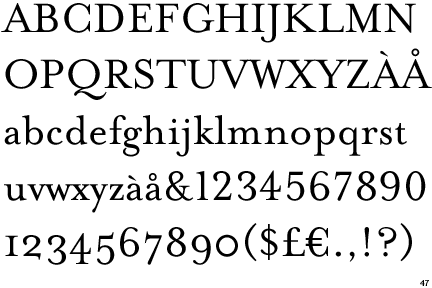
-- Does your font have small caps? If not name a font that does.

My font, Mrs Eaves does have small caps, along with a wide variety of weights.


-- Ligatures? why are they used? when are they not used? what are common ligatures?

Ligatures are two letters that are connected because they would overlap or throw off the the kerning between the other letters. "The Chicago Manual of Style, for example, advises against using them in Latin or Greek transliterated words or in foreign words that have been adopted into English and are thus in an English dictionary. They do, however, recommend using ligatures to maintain Old English spelling in an Old English context or in foreign languages where they are commonly used characters." Common ligatures include the lowercase "f" attached to a letter like "l" or "i".


-- Does your font have ligatures? If not name a font that does.

My font does have ligatures

-- Difference between a foot mark and an apostrophe?

A foot mark does not have the rounded part at the top. It looks more like a vertical dash whereas the apostrophe has a rounded appearance with a circular part at the top.

-- Difference between an inch mark and a quote mark (smart quote)?

This is similar to the difference between a foot mark and an apostrophe. The inch mark is a double prime or vertical dashes whereas the quote mark is two curved lines with circular attachments at the top. 

-- Hyphen, en dash and em dashes, what are the differences and when are they used.

An em-dash is typically used to act as a comma or parenthesis to separate out phrases—or even just a word—in a sentence for various reasons. dash is a longer line—double the length of a hyphen—which indicates a break or an interruption in the thought. Dashes are used to set off part of a sentence.The en dash connects things that are related to each other by distance, as in the May–September issue of a magazine.


Final three Compositions - Viscom

Here are the final three compositions I have created for Viscom.This project taught me about the amount of process that goes into making just one final design. If you put in the work from the beginning you will be at a better, more refined place later on. I was pushed the most when it came to creating original designs. With the amount of infographic design available on the internet in today’s world it can become difficult for a designer to be original. It was challenging to find the line between inspiration and copying. Throughout the process of this project I never felt 100% comfortable with the designs I was creating. It took me a long time to get into the grove of creating work I would actually be proud of. In the end I was able to come up with three infographics that I feel confident are my best work thus far in the project. I stepped outside of my comfort zone throughout the project by experimenting with various types of papers and materials. My only complaint about the project is the amount of time we had in class to receive feedback from not only our professor, but also from our peers. I tend to grow and I become more inspired as a designer when I can see my peers’ work compared to my own. It allows me to gauge whether or not my designs are on par for what the project requires  However, for this particular project the amount of class time we had was very limited so it forced me to fall back on my own understanding of infographic design, as well as the design work I could find on the internet. I believe altogether the project was a success and it taught me more about design, and my own willingness to push my ideas further than I was originally anticipating. 


Tuesday, October 20, 2015

First 15 Compositions, VISC 204

For the first 15 compositions I decided to try different things and push myself off of the computer. I wanted to use illustrator mixed with images and try to make my ideas visible.


Thursday, October 15, 2015

[P3]:1


Information about Mrs Eaves Font

It is a Serif

Designed by Zuzana Licko

Zuzana also designed the fonts: Base 9 and 12, Base 900, Base Monospace, Citizen, Dogma, Elektrix, Filosofia, Hypnopaedia, Journal, Lo-Res, Lunatix, Matrix II, MatrixII Display, Modula, Mr Eaves Sans, Mr Eaves XL Sans, Mrs Eaves XL, Narly, Oblong, Program, Puzzler, Senator, Soda Script, Solex, Tall Pack, Tarzana, Totally Gothic, Triplex, Variex and Whirligig

Mrs Eaves was designed in 1996

It is a Transitional Serif

Its family members consist of: Roman, Italic, Bold, Bold Italic, Small Caps and Petite Caps


General Font Information

Old Style: (ex. Bembo, Sabon and Monotype Garamond) curved strokes whose axis inclines to the left, and little contrast between thick and thins. 

Transitional: (ex. Baskerville, Mrs Eaves and Georgia) they mark a transition from the former Old Style types and Modern types

Modern: (ex. Bodoni, Bedini and Dubiel) It has high and abrupt contrast between thick and thin strokes and abrupt (unbracketed) hairline (thin) serifs

Slab-Serif: (ex. Archer, ITC American Typewriter and Officina Sans) This font was born In Britain as an advertising scheme. They wanted a font that would stand out against the page. 

Sans-Serif: (ex. Helvetica, Avant Garde and Arial) A Sans-Serif font is one that does not have Serifs at the tops or bottoms of each letter. 


Stroke Weight: The general thickness of the lines that a letter is comprised of, in other words, how bold the font is

Axis or Stress: In typography, the axis of a letter generally means the axis of the stroke, which in turn reveals the axis of the pen or other tool used to make the letter. If a letter has thick strokes and thin ones, find the thick strokes and extend them into lines. These lines are the axis (or axes; there may be several) of the letter. Not to be confused with slope.

Small Caps: Create a clean line with no ascending elements, and mix well with lowercase letters

Lining Figures: Uniform in height and align with the baseline and x-height

Non-Aligning Figures: When the figures, typically the numbers dip below the baseline and above the x-height

Ligatures: Letters that come together to avoid a clash of characters. The f joins with the lowercase letter I to create ligature

Type Measurement: The point system used to measure type refers to the way type was laid out on the press. Referring to the metal body the type face was mounted to.

Below is an image that shows the anatomy of a typeface:


Wednesday, October 14, 2015

[P2]:Final

This project was a two step process defined as:

1—use fontstruct® to create a typeface then, 2—develop a content-rich, analogue/print specimen to persuade the recipient to ultimately use your typeface. consideration should be given to the audience—students, designers, art directors or other design-related, typeface-loving professionals conversant in basic typography and design.

I began the project with the notion that I would not like designing a typeface, however, this was proven untrue by the end of the project. I really enjoyed the final work I created and I am proud of my typeface. The most important thing I learned from this project is that the way we present our work as designers is just as important as the work itself. The keywords for my font are: sharp - the font consists of many right angles and the decorative aspect that cuts through the letters resembles a cutting motion; linear - There are very little curves in my font. I tried to reduce the amount of distractions by making everything very clean lined; contemporary - The font could be used in a modern apartment complex, or used to describe something futuristic. 

Below are some images of my final deliverable mailer and poster. 


Wednesday, October 7, 2015

[P2]:6

I made revisions to my poster based on what other people said about my work. Here is the poster printed off tiled.


Monday, October 5, 2015

[P2]:5


These are the first iterations of my final deliverable poster. I hope that the graphics represent the sharp and dramatic nature of the font.