
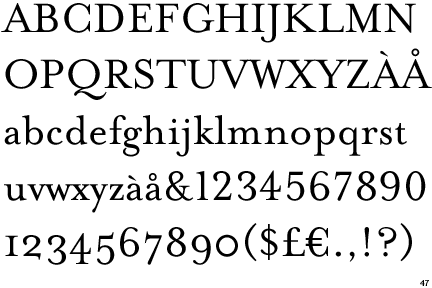
Information about Mrs Eaves Font
It is a SerifDesigned by Zuzana Licko
Zuzana also designed the fonts: Base 9 and 12, Base 900, Base Monospace, Citizen, Dogma, Elektrix, Filosofia, Hypnopaedia, Journal, Lo-Res, Lunatix, Matrix II, MatrixII Display, Modula, Mr Eaves Sans, Mr Eaves XL Sans, Mrs Eaves XL, Narly, Oblong, Program, Puzzler, Senator, Soda Script, Solex, Tall Pack, Tarzana, Totally Gothic, Triplex, Variex and Whirligig
Mrs Eaves was designed in 1996
It is a Transitional Serif
Its family members consist of: Roman, Italic, Bold, Bold Italic, Small Caps and Petite Caps
General Font Information
Old Style: (ex. Bembo, Sabon and Monotype Garamond) curved strokes whose axis inclines to the left, and little contrast between thick and thins.Transitional: (ex. Baskerville, Mrs Eaves and Georgia) they mark a transition from the former Old Style types and Modern types
Modern: (ex. Bodoni, Bedini and Dubiel) It has high and abrupt contrast between thick and thin strokes and abrupt (unbracketed) hairline (thin) serifs
Slab-Serif: (ex. Archer, ITC American Typewriter and Officina Sans) This font was born In Britain as an advertising scheme. They wanted a font that would stand out against the page.
Sans-Serif: (ex. Helvetica, Avant Garde and Arial) A Sans-Serif font is one that does not have Serifs at the tops or bottoms of each letter.
Stroke Weight: The general thickness of the lines that a letter is comprised of, in other words, how bold the font is
Axis or Stress: In typography, the axis of a letter generally means the axis of the stroke, which in turn reveals the axis of the pen or other tool used to make the letter. If a letter has thick strokes and thin ones, find the thick strokes and extend them into lines. These lines are the axis (or axes; there may be several) of the letter. Not to be confused with slope.
Small Caps: Create a clean line with no ascending elements, and mix well with lowercase letters
Lining Figures: Uniform in height and align with the baseline and x-height
Non-Aligning Figures: When the figures, typically the numbers dip below the baseline and above the x-height
Ligatures: Letters that come together to avoid a clash of characters. The f joins with the lowercase letter I to create ligature
Type Measurement: The point system used to measure type refers to the way type was laid out on the press. Referring to the metal body the type face was mounted to.
Below is an image that shows the anatomy of a typeface:

No comments:
Post a Comment