
Phase 3
Phase three of project one allowed us to use both color, the computer and various different sizes in our font. Also, we were permitted to utilize typographic rules. For this phase it was difficult not to become overwhelmed with the amount of options we were permitted. Rather, I had to focus my eyes on what I was creating and think outside of the box. Most of my designs from this phase seem much more creative and expressive than my previous two iterations. I utilized various text sizes as well as the overlapping of text to get the look I desired.


Paul Rand
Paul Rand was born in Brooklyn, New York in 1914. Although Paul Rand the person might not be easily identifiable to the general public, the work he created is. He did amazing logo designs for large companies like UPS, IBM and ABC. Rand also worked as the art director for Esquire's fashion pages.
Information from: http://thinkingform.com/2014/09/24/thinking-mimmo-castellano-09-24-1932/#/2013/08/15/thinking-paul-rand-08-15-1914/


Information from: http://www.designersandbooks.com/designer/bio/paula-scher
Information from: http://thinkingform.com/2014/09/24/thinking-mimmo-castellano-09-24-1932/#/2013/08/15/thinking-paul-rand-08-15-1914/


Max Huber
Max Huber was born in Switzerland in 1919 and studied at the Zurich school of Arts and Crafts. He worked for many different people across Europe and his portfolio ended up being very diverse. His work infused text and images in a way that made the piece very visually intriguing.
Information from:
http://thinkingform.com/2014/09/24/thinking-mimmo-castellano-09-24-1932/#/2011/06/05/thinking-max-huber-06-05-1919/


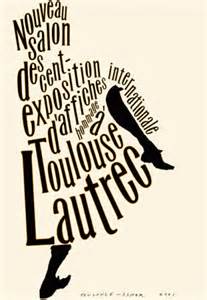
Robert Massin
Robert Massin began designing books at the age of seven. Massin was another designer who worked a lot with pictures and text. He was amazing at merging the two together. Some of his most famous work came from the silhouette images he made for “The Bald Soprano”.
Information from:
http://creativepro.com/dot-font-massin-the-unclassifiable-free-thinker/


Erik Spiekerman
Erik Spiekerman is from Germany, he was born in 1947. He began working freelance in 1972 and after 7 years he started MetaDesign with two other people. He has since left MetaDesign and no works at his own company called Edenspiekermann. He works primarily in the fields of type and logo design.
Information from:
http://thinkingform.com/2014/09/24/thinking-mimmo-castellano-09-24-1932/#/2011/05/30/thinking-erik-spiekermann-05-30-1947/


Armin Hoffmann
Armin Hoffmann was born in 1920. The designer created great posters that utilized black and white designs. The lack of color pushed the designer to express a meaning without spelling it out for the onlooker. The majority of his career was spent in the classroom. He taught an advanced graphic design course at Allgemeine Gewerbeschule (AGS) in Basel.
Information from:
http://thinkingform.com/2014/09/24/thinking-mimmo-castellano-09-24-1932/#/2011/06/29/thinking-armin-hofmann-06-29-2011/


Paula Scher
Paula Scher began her career as an record cover art director at Atlantic and CBS Records in the 1970s. She has since branched out to brand identity where she has done work with many large companies from Coca-Cola to The Daily Show with Jon Stewart. Scher's use of type as the physical image is unmatched by any other designer. She integrates type so that it becomes the image she is trying to convey.Information from: http://www.designersandbooks.com/designer/bio/paula-scher


No comments:
Post a Comment